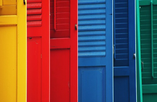
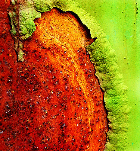
Ironically , in this colorful world, the eye and the brain find balance in mid-gray. Complementary pairs of colors combine to make gray , so the eeye needs both colors. Try staring at red apple for about 20 seconds , then at a white of paper - you will see a green apple , because the eye automatically supplies red to restore balance. Of course , photographs that contain only reds, oranges and yellows can be wonderfully energizing and photographs that contain blues, purples , and greens can be soothing to the eye and uplifting to the soul. The contrast of cool and warm colors in a picture , however , creates the balance the eye seeks.

Photography Tips
No comments:
Post a Comment